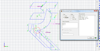
But I sensed a puzzle in that shape, so I drafted and modified the outlines to explore relationships between all the lines, curves, and angles. Hidden relationships emerged as the shape evolved.
A new puzzle emerged with so many similar curves and angles that 8 of the 9 pieces could fit together without any of them being correctly positioned. But was it a good puzzle? No, not really. My friends had no trouble identifying the correct positions, and some of them couldn't even discover those "wrong" positions without considerable effort!
The puzzle at right is solved correctly, while the puzzle at left is shown with all the pieces in wrong positions. It was a failure, but a very instructive one. So, could I re-design the puzzle so the correct positions were more like those in the puzzle at left?
Starting from scratch I designed a new layout, paying close attention to feedback from my testers. What emerged was a dissection of a Rupee sign into just eight pieces. Each piece fits into the frame in more than one location, but most look like there's only one possible place to put them--and it's usually the wrong place!
The classic T letter dissection puzzle requires four pieces for its relatively simple shape, so I'm thrilled to dissect such a complex shape as the Rupee sign with just twice as many pieces. I had to allow some wacky variations in shape and size, but it works. Moreover, the frame actually enhances the challenge by discouraging the user from removing pieces that might have been incorrectly placed!


No comments:
Post a Comment